Showing posts with label Class Assignment. Show all posts

Monday, March 21, 2011

1. Lots of Dead stuff


Ok, so what the hell is that in the bottom left? Like an alien termite or something!! Also, notice the Lord of the flies pig head, it is my favorite.


Googly contour drawings are very fun to do.

Tuesday, January 25, 2011

Hip-ley's Believe it or not!

Today was very frustrating to say the least. My shoes hurt my feet, I ruined my favorite shirt by splashing oil based ink on it, missed a bus, and spent six hours on printing and have nothing to show for it even though the drawing lovely. So to try and turn the day around I did a digital mock up that slightly resembles what I had in mind when I stepped into the studio most optimistically. This project was meant to be fun!! I really have to fight the urge to combine my school work with my "professional" or illustration practice. These classes are skill classes and they should go better as long as I focus only on learning the techniques, not the end product. How can a ruined piece of paper create such emotional crisis?!

Though I wish monoprinting was coming a little easier to me, my digital art work sometimes takes on a lot of the characteristics of an original print. Often I merge all the layers to prevent myself from going back after a few different versions have been made. Which is similar to "striking" a plate once an edition is done. That way the complete freedom of the computer program can be utilized but then made special by willingly closing the chapter on that image. One could even go further and completely delete the original file but that seems a bit rash, at least for a clutter-bug like me. 

Wednesday, December 8, 2010

Facade of the Chicago Stock Exchange: The Key to Designer Heaven

Exerpts from a final paper for an Art History class. Most of the descriptions were left out to spare you readers as well as a whole section of badly argued connections to Islamic artwork. Critique wise I agreed that I talk too much but don't say enough and need to learn to weave in more factual information. Either way I thought sharing my lyrical ridiculousness would be kind of fun ;) But also, pretty pictures! 

    
          Of all the artifacts that the Seattle Art Museum has acquired over the years, none are quite as interesting or underexposed as SAM's Louis Sullivan's 1893 Chicago Stock Exchange Elevator Facade. It went on display in the American Art gallery March 31, 2010 after it was purchased from Sotheby's auction in 2008 from an undisclosed seller for an undisclosed price[1]. It resembles a prop taken straight out of the 1982 science fiction film noir, Blade Runner, in that it holds the same elements of ancient design glazed with modernity . Such a film reference might not crop up in everyone's first impression of Sullivan's design but that sense of mixing of past and future grandeur surely comes to attention. The elements incorporated seem both familiar and alien, archaic yet modern and it's mystery deepens when made known that the artifact was in fact rescued from the rubble of the original Chicago Stock Exchange demolished in 1972 as part of Chicago's Urban renewal project. The facade then becomes the coded message outlining Sullivan's own methodologies and obsessions with design as something higher than just art calling for an absent Rosetta stone. Definitively defining the inner workings of an artist's mind and intention at the moment of creation is of course impossible, but through tracing certain impressions and imagery that appear in the elevator facade a hypothesis of motivation can be developed. From what is presented to the viewer, the numerous allusions made to the divine point to the Chicago Stock Exchange acting as a threshold to modern spirituality that emphasized society's reverence for the accumulation of abstract wealth, a wealth that allowed Sullivan to indulge in his personal glorification of high design.


      When the overall layout of the Sullivan's Elevator covering is taken into account a tentative connection is made with another historically well known entrance design. The facade designed for the Chicago Stock Exchange is completely symmetrical and as stated before sectioned off into rectangular quadrants that frame specifically designed images without allowing cross contaminate from one section to another to occur. This high level of boxy structuring and grandeur, as well as the shared bronze-gold coloring alludes to a connection between the elevator facade and The Gates of Paradise designed by Lorenzo Ghiberti . As a student of architecture and art at the Ecole des Beaux-Arts,  it is more than likely that Sullivan encountered Ghiberti's work, especially his infamous gates that are the cornerstone of any European art history curriculum. The Gates of Paradise show ten scenes from the Old Testament and also uses intimidation factors (size, gold wealth, dramatized scenes of Godly acts) in bringing church goers into the mindset of worship when entering the Florence Baptistery. The similar amount of detail, scale of design and use of encapsulating gridded formatting bring about similar feelings of "smallness" in the viewer. Something able to effect even those uninterested in the religious connotations that Sullivan created by unabashedly tying his facade to the religious teachings of the past. In doing so he creates an identical feeling of entering someplace holy through gates that no doubt intend to simulate the indoctrinated image of the "holy gates" otherwise known as the illustrious gates of heaven.

         Take Sullivan's obsession with the circle in these works, a shape we often take for granted because it is so integral to human imagery. "Visual Entropy", or the point of "maximal symmetry, visual and constructional simplicity" has been an obsession for artists, scientists and philosophers for centuries. The Platonian, aka perfect, circle is as un- attainable as God or a let's say, a reliable economy. It's use in the facade points to the designers awareness, if only subconsciously, that the circle is the truest image of the divine and that it will continue to be read as a legitimate part of design for eons to come without the help of recognizable biblical or religious Imagery. It will never grow outdated, unlike the time-specific relief illustrations of The Gates of Paradise, which show telltale signs of their time period. Sullivan's use of the circle as motif render his design as timeless and ideologically transcending of what he saw as the restrictions of modern architecture. In this decision Sullivan finds his own description of the higher power independent of modern material culture and past theological organization that relies on the discovery of timeless imagery at the root of human artistic pursuits.


        In 1896 Sullivan said that "The artistic challenge of the tall office building is to proclaim from its dizzy height, the peaceful evangel of sentiments of beauty, the cult of higher life". Donald Hoffmann responded by asking what the "virtue of a building [is that's] trying to pretend it's something it is not?" Sullivan's gate acts as a threshold for the divide between the mundane unobserving world and the heavenly revelry in technology and human romanticism that the elevator embodies at this time as a new innovation saved only for the powerful wealthy. This divide is contrary to the famous quote "form ever follows function" that Sullivan is so iconically connected with (stated on the Seattle Art Museum description plaque) because instead of building to fulfill a practical requirement he's woven in a very un practical spiritual message that the majority of those viewing and using his design would be uninterested in comprehending. Not only would people be unwilling to decode his elevator but to do so would be to pull away from their worship of money and go back to means of revelry characteristic of an obsolete system of quiet contemplative building patronage. They see the money the building houses, not what the architecture's ornamentation is directly attempting to teach them.


         The facade, echoing The Gates of Paradise is what bars people and allows people to enter a place of either damnation or salvation. Damnation being the world of the commoners stuck in the everyday struggle against the mass of bodies, and salvation the upward mobility of those who can become part of the exclusive club of the educated , privy to secrets and admiration by those further down. This rift can also be characterized as "the artistically enlightened vs. the economically savvy", a struggle Sullivan himself experienced in completely relying on his partner Dankmar Adler to secure such large scale design projects and funding.
        Either way, the doorway itself holds hope for salvation of the perfect world and perfect circle. The facade represents a fork in the road between those acutely aware of the polar hemispheres of knowledge and those unaware and fortunately un-pestered by the realization that everyone is striving for a non-existent utopia, be it a godly, financial one or even a purely visual one. Sullivan exploits this by weaving that hope of someday reaching perfection or "designer's heaven" into the stoic facade through a language that the stock brokers and money managers will unknowingly misunderstand, thus protecting his personal expression of faith. That faith being in the simple beauty of an object and the natural principles it relies on. The faith that there is something truly eternal hidden in the human existence driven by consumption and constant cross exploitation.

Monday, April 19, 2010

Camouflage


Second week illustration for a poem containing wolf packs and sharp toothed loves. Was very jumbled when it came to this assignment and after a lot of inward childish huffing decided to just work on simplifying and actually planning out some sort of composition, because I lack any and all design skills haha!

Before leaving for class I looked at the image from a distance and my eyes couldn't really focus on the picture as a whole, like the last assignment there were two competing elements. In this one I really loved the wolf figure, and guess what? My teacher basically said the same thing, saying to further improve the picture by completely eliminating the back figure (which I may do later on).

The idea that this woman from the poem gained access to another culture through her loved one was really important to me. What was odd about the story is that she seamlessly is able to interact with them, when really no matter how much she would try there would always be her and them tenuously linked by a romantic relationship.

 Right now, at least from the perspective of someone living in an extremely liberal and open city,  people often want to push culture to the side so that they can take part in the surface culture of the American mass. However, even though we are told not to point out the obvious (and mostly beautiful) differences between each other out of a fear of being labeled either judgmental, naive or even racist, there still exists an overall insecurity in having an identity that automatically becomes exclusive because of natural differences in upbringing, religion or economic well being.

I'm not saying that everyone should link arms with "their own kind" and turn their back on everyone else, just that it's useful to understand that there's a power to being and insider and an outsider. That a person should ultimately be able to tread between the two without feeling guilt or shame. 


Thursday, April 15, 2010

Where we come from


Plato's take on where "love" came from. There's a lot that I learned during this process, and even with it's many shortcomings there are moments in this project that I'm really proud of, so I hope you enjoy these. Ironically I just got back from the SVA Illustration and Cartooning thesis show that dealt greatly with the Greek/ Roman gods, so on some level I was working right alongside them on something similar :)
(These were cut out and placed on plastic sheets so that when one opens the book one is introduced to all three types of humans at once)


(Zeus' head flips up to reveal...)


(THE HEAAAVVEEEENNSS!! *angels trumpet*)


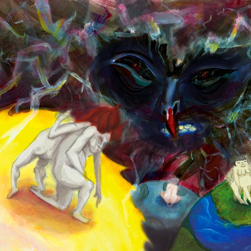
Wanted the story to end in a way that shows the quest for our other part and how it doesn't always lead right away to the proper person. When I imagined the story all I could think of was this sort of rubbery squelching sound of the objects in space rubbing against each other as they passed or hooked into each other. Which really doesn't make much sense since there's no sound in the vacuum of space, but since the logic of the solar system was thrown to the winds anyway there can't be much harm in it haha

Monday, April 5, 2010

Gettin there.


A try at the ol' photoshop. Had a totally different idea about this piece but for the purpose of an illustration assignment decided to zoom in... I handled this kind of sloppily and like always I reverted back to sticking the primary compositional element in the corner heh, oh well.

See originally I just wanted the forest and this sort of lone light hanging in the back obscuring things and sort of illuminating the only colors in a primarily blue, black and grey environment. But then yeah, for the class I figured nobody would get it, it's too abstract so I added the girl. Then after the initial feedback I went back, and started wondering who put the light there for the girl to find. So basically the inclusion of one character totally skewed the whole thing and made me overexplain things! Dangit!

Don't even properly care about this like the original so whatevs! Am trying to be more laid back about things and just ride out this last part of the year. A lot of times I take things really personally, especially grades and school work and stress out to the point of malfunction.

So if this blog lags for awhile, it's only because I'm gathering my wits, or going into a semi comatose state to make the journey through deep space seem shorter.


Thursday, April 1, 2010

Fire Venus


For the first time since high school I did a lino cut. Our drawing class has been gearing up for this for the past few weeks so it was fun to actually produce something. There were some issues with the model, so we worked independantly for the first half and had the choice of incorporating her in the second (which I did).
When starting I wasn't sure what I wanted to do so just started doodling a little and eventually it morphed into someone who resembled the Venus of Willendorf, so there ya go
Of course when moving it to my apartment to finish, lining the plate up became a problem, but all in all it seemed to work out in the end. Enjoy more of my short rotund women!

note: Had an amazing day in etching today, but unfortunately the scanner at my disposal gets really fuzzy and I want you to see them proper. Must...learn...PATIENCE!


Thursday, March 18, 2010

P!L!A!T!O!

Whoa, I didn't realize how bad blogger faded images, but dang these look awful! Haha, anyway, this is a snippet from an ongoing project in my Storytelling/ bookmaking class where I'm illustrating Plato's symposium, specifically the part talking about the origin of love.

Am not enjoying this project very much, mostly because of the pace at which we have to turn out work and the constant headbutting with the teacher over the medium I'm using (acrylic). Also the longevity of the project doesn't really allow for much growth. The entire class has been a bumpy ride because of the odd relationship with the teacher. On the one hand I think they're really nice and a fantastic artist. However my ideas and work habits are always met with borderline disrespect. Bummer yes, but whatever, will pump out the last few pieces and call it quits, FINITO SUMMER WHOOOO. MONTHS OF FREEDOM!SUNSHINE!BEACH!ICECREAM!!


Thursday, March 4, 2010

"Is it a real owl?"


A Blade Runner themed drawing for a poster assignment. Was instructed to erase a few things and simplify for the final, but I very much like the original just as a drawing, enjoy :)

Sunday, February 28, 2010

You may just want to ignore this. (Edit: or maybe not)

Ready your army of the world's smallest violins, because this is gonna be a doozy!


Hey Guys guess what?! It's late and I'm tired and angry. Why? Because I make pieces of crap like this! I'm pretty darn selfish, so you know what? I'm gonna tell SVA to suck it and puke me back into the real world where I can actually take the time to paint, print, make pictures that actually matter and get a real education! It's Almost too scandelous to even fathom! Two and a half months and counting folks and I'm OUTA HEYA!
--------------------------------------------------------------------------------------------
(Edit)
Ok, I have to grow up and realize a few things. The first being that I am not technically sufficient enough to fully realize what I'm trying to do in my art. I am a baby. The Second is that if I don't actually spend the time practicing and opening myself to new things I will never become a great artist, or even a good one.
Sitting this morning in the aftermath of what could only be called a panic attack, it has become clear that my anger is normally directly linked to my frustration. My brain shuts off and I work myself into such a state that the entire world seems to bend in, suck my breath away and make progress impossible. Recently I read the horoscope section of the Village Voice and it said that it is a good time to face ones bad habits and self inflicted "learning disabilities" and conquer them. So that is exactly what I am Going to do!
Also I would like to apologize to SVA, which is a legitimate art school that I owe a lot to. Especially the teachers who have done nothing but help and guide me. But at some point one has to learn to guide oneself and stop relying on an institutionalized schooling to give a sense of worth and accomplishment. I AM NOT SAYING EDUCATION IS NOT IMPORTANT!! It's just that you have to find a place that nurtures all aspects of a student and leaves enough open for personal aspiration and exploration. So wish me luck :)

By the way, here is the piece based off a short story about a woman who was eating too much and a man who was eating too little because they were so sexually frustrated lol. I actually liked parts of it this morning when I woke up, but just as I found it unclear so did my classmates (He's supposed to be wrapping around her), so expect at least some sort of redo, because I loved the underdrawing and really want to save it!

Looking on the bright side: the colors were strong enough in real life without the help of the computer and I got complimented on the improvement of my composition :D

Monday, February 8, 2010

In Class Today

I showed folks this:


and this was my theme music!


Monday, February 1, 2010

I SWEAR IT WILL GET BETTER, any second now.

Yaaaaayy, haha, here's Marie Antoinette in a confusing composition devoid of proper contrast or watercolor technique OR ANATOMY!
Man, Does anyone else ever just get really frusterated at their current predicament. I feel really wierd right now, maybe because illustration as a focal point of my art just seems to fit a little less every day. Or maybe its just because I've been listening to conceptual artists too much. Either way, my disinterest in my assignments, school and traditional art school education in general has left everything a little rickity, so i've been analyzing what being successful in art means to me, and how I can fit that into the real world and somehow survive financially all at the same time!

But yes, realize that these little introspectual rantings are really not that fun to read, so I'll try uploading little interesting tidbits that are seperate from my art, because I have so much more that i want to share with you guys! SO MANY BEAUTIFUL MONSTERS AND TOYS AND MUSIC AND LOVE and hate lol.
Am making a gooey lovey dance mix, so stay tuned!


Monday, January 11, 2010

A "Polished" rant.


Hello there folks! Kicked things off with a running start today with the first critique of the shiny new semester. It was a pretty interesting one since we had a substitute who actually systematically went through everyone's pieces and picked out all the inconsistencies. And DANG there were a lot! Most were sort of practical sharp observations about the technical aspects, but the biggest issue she had with mine she had was the mixing of the "Tragedy and Poetic/romantic" elements which through me a bit of a whammy because Tragedy is made romantic all of the time, and clearly my picture is fantasy. It sounded like she wanted there to be less substance? This teacher saw two seperate stories while I saw one? Her family perished in a tornado?

The focus was meant to be on the two tornado's having their moment and the houses were supposed to be just structural, like playmobil houses. And I know theres a cow! Because its bloody funny! I don't know, when I told her that I was offended that she thought me to be making fun of the dead (after coupling her own initial indifference toward the Crash in the twin towers with my painting mind you) she said she wouldn't mind me making fun of folks dieing. DEATH IS TRAGEDY. I say Watson this logic is circular!

But I didn't really disagree with any of her points she made. People do need to be aware of how their art comes across to other people, and clearly this picture is not as clear as it should be if the above was talked about. The whole bottom part of the picture is muddy. Haha and I respect her appreciation of stylization...and looked up her art and really liked it though it wasn't what I expected at all, yet still fit her to a T. Balls Ladies and Gentlemen, this lady has balls!

Which brings me to my next point, the fact that women artists have to have bigger balls than most other men folk, or atleast feel they need to feign them when dealing with others. A friend was telling me about her storytelling teacher and that she is absolutely terrifying and is constantly going on about how hard she's had to work just because she's a lady. Maybe I'm just really thick headed or just live in a really open artistic environment but do people look at my art differently because I'm a girl? Is it really that much harder to be an artist with a vagina? Thats so wierd since art school is a pretty estrogen infested place, but how many of those women actually use their skills after, or just give up when babies arrive? Not that commercial success is artistic success, so thats a little nebulous. OH MY GOD there might be a whole secret population of matronly van goghs trolling about our population and we wouldn't even know it because they're too busy suckling their male offspring!

Cool :)


Friday, December 18, 2009

Training for naive digits.

1) A drawing of Self portrait with Cigarette by Max Beckmann
2) Rope from the pier.
3) Animals from the natural history museum. 


Pop Ups (part 2)

What contained has no lid but still holds golden treasure?

Tuesday, December 1, 2009

Pop-up Riddles!

"At night they come without being fetched, and by day they are lost without being stolen."


"What Cannot be seen but only heard and will not speak unless spoken to?"

Monday, November 30, 2009

Interpret This Truth (BITCHES!)


I am no athlete, but just like someone who waits for the gun to fire before a race my heart pumps furiously right before a critique. Normally I come prepared, or at least think that there is some merit in what has been created. This was the case with the above illustration meant to show a relationship. However when trying to address the compositional problems of the first (which I didn't completely agree with) and place in color everything came crashing down. Won't go into detail with all the circumstances that produced the monstrosity below because you all have eyes of your own and thus own judgments.

But the worst part is having to show my very talented class and knowledgable teacher what I had done. It was awful. I dreaded it so much that my dreams the night before were filled with chastisement and suffocating shame that would crush even the strongest of backs.

So look upon the soft black and white version as the true image, and the color as only a shallow unnatural abberation of something that deserved more.